
How helpful it is, when standing in the drawing-room with awkward guests, to have some modern art to focus on. Andrew Solomon finds prints which won’t leave you skint.
There are many disadvantages to the new three-volume London telephone book, primary among which is the impossibility of locating anyone’s telephone number. A second is that the “views of charming bits of London,” which have for some years graced the covers of the four-volume set, have given way to more baroquely coloured and even more undistinguished illustrations of rather less charming bits of London. Whereas the old illustrations were actually prints, available through British Telecom, the new ones are paintings, commissioned by British Telecom but not foisted upon the general public in any more obtrusive form than as telephone-book covers. It is true that a thousand prints of Richard Downer‘s particularly unprepossessing watercolour of the Lloyd’s building — on the cover of the new “Business and Services” volume of the telephone book — were made available to the first thousand who chose to fork out £25 for it, but this cannot be seen as more than a grace-note salute to the British Telecom tradition of print folios. The edition of four local scenes has run its course, and British Telecom, like the Bauhaus, has closed its doors on a world in-flux, which may in retrospect place increasing value on the greatness it has left behind — for, to put aside irony for a moment, one cannot help noticing that the idea of the contemporary print has appeal in Britain at every level of society; inexpensive art with a signature upon it is hard to find, and is ever to be cherished.
The National Art Collections Fund, a noble institution, has stepped in to fill the gap left by British Telecom with its own edition of four prints, which are being sold to benefit the Modern Art Fund of the NACF. The fund was founded this year because the simple business of acquiring contemporary works of art, which used to be agreeably economical, has become increasingly expensive, so that museums now find themselves unable to compete in the market-place for work by living British artists. Of course the same problem afflicts potential donors to the NACF, and the print launch is a sort of two-birds-with-a-single-outsize-rock affair; the money raised will help museums unable to afford contemporary art, and the prints purchased will substitute for contemporary paintings on the walls of the NACF supporters.
The prices asked for the prints are in keeping with the current market; one is not, on this occasion, making a donation and receiving a semi-precious item as a symbol of thanks, but rather making a perfectly reasonable purchase. Since the whole project has been generously underwritten by Richard Ellis, almost the entire price of the prints goes directly into the Modern Art Fund, which stands to benefit by almost £100,000. The Modern Art Fund has raised just over £200,000 since its inception earlier this year, and is working towards establishing an endowment of £3 million. The print folio is proposed as an annual event, and should, one would think, be successful not only because its mode of self-reference is so charming, but also because the work is really very good work sold at a realistic price with the auspicious guarantee and the well-trained eyes of the NACF behind it. Each print will be issued in an edition of 75, with 25 artist proofs, most of which will be presented to major British museums. This, of course, affirms and increases the value of the prints themselves, since to own something the Tate displays is more economically sound than to own something you and only you have touched and known. The whole project is in keeping with what Bernard Jacobson, one of the leading London dealers in contemporary prints, has described as a renaissance in print-collecting after the fallow mid-Eighties.
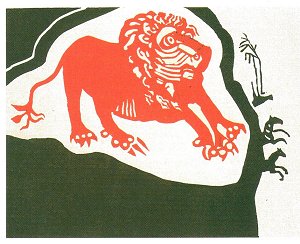
The pleasing and humorous crimson lion in Edward Bawden’s Lion and Zebras, a lino cut in two colours.
The choice of print-makers this year is conservative but not dull. Edward Bawden, John Piper, Craigie Aitchison, and Elizabeth Blackadder have each been commissioned, and they have turned out work which is various both in its appearance and in the attitude towards print-making which it shows. Bawden, at 86, is rather the grand old man of British prints. His exhibition earlier this year at the V&A shows his development over a lifetime of print-making, and featured the various enormous projects he undertook on his Albion press. Bawden is known for his work as a war artist during the Second World War, and for his numerous advertisements, books and posters. The NACF print is immediately appealing, and it grow on you as you continue to look at it. Lion and Zebras is a lino cut in two colours, simple, straightforward, and strong. The crimson lion is a cross between heraldic and tribal in his style, an amalgamation of the idea of a lion by someone unacquainted with the beast and the idea of a lion by someone who has known too many. The Lion is set in a field of olive-green, which at its right-hand edge breaks into the shape of two diminutive zebras, scampering away from the great red hunter. These animals, the size of the lion’s claws, seem to be straining to escape from the picture altogether; but their energy is counterbalanced by a palm tree, also in green and of their scale, which sways whimsically above them, back towards the lion. This print is pleasing and humorous, fulfilling its own intentions with a neat finality. It is offered for £150 pre-publication or £200 post-publication.
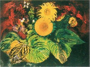
John Piper’s Sunflowers, in a style all too reminiscent of Sixties American tablemats.
The John Piper etching and aquatint is not much to my taste; entitled Sunflowers — an egotistical reference to Van Gogh? — it is done in a style reminscent of the great Sixties master of American tablemats, a woman called Vera who brought the pleasures of the garden into the dining-room on laminated plastic. Against a murky background of swirling red and grey, the colours of clotted blood and mottled clouds, Piper has arranged a pyramid of weighty geometric flowers. Green leaves seem to strain out of the space of the etching at the bottom, baroquely angled down toward the viewer; further up, the flowers are a flat disc and a radiant star-shape, contained by the composition’s space. But Piper’s recent work is all like this, solving formal problems that were rather successfully confronted in the seventeenth century with a subject matter so hackneyed that one keeps trying to locate its irony. If Piper’s is the weakest of the four NACF prints, however, it is also an appropriate foil to the more successful work of the other three artists, since its sheer conservatism balances the variety of their experiments. Like Bawden, Piper is now 86, and even an optimist must accept that when his oeuvre is complete this will be categorised as a late work. Like the pleasant landscapes Malevich did in his last years, this may take on the value and fascination inherent in old age’s rejection of the notion of progress. The Piper, interestingly, is by far the most expensive print, at £750 before publication and £1,000 after publication.
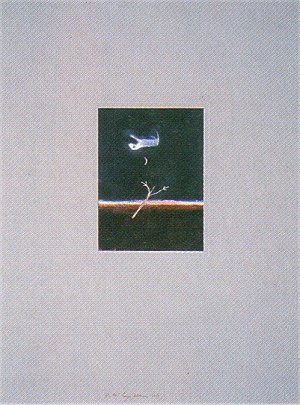
Wayney, a Bedlington terrier, in transit to a doggy place in the sky in Craigie Aitchison’s Wayney Going to Heaven.
Craigie Aitchison and Elizabeth Blackadder are younger than the other two print-makers, and their work is the richest and most appealing in the NACF series. Aitchison has done a screen print in 22 colours called Wayney Going to Heaven. Aitchison has always had a Bedlington terrier — sometimes more than one Bedlington terrier — and they are a frequently recurring motif in his work. Wayney was dearly beloved and his death in 1986 sent shivers of anxiety through the art world. People wondered: would this be an inspiration for poor Craigie, or simply the source of such despair that he would cease to work and pine away? Fortunately he has chosen to pay tribute to his loved one in his work rather than in silence. We find Wayney floating upside down above a barren landscape, in transit to a doggy place in the sky. On the ground, there is a single leafless tree; a nail-paring moon floats between terrier and tree; and at the horizon are all the rich colours of the brink of sunrise, or of the last moment of sunset. The tiny picture is in the middle of an enormous piece of paper, the entire image afloat, much as is Wayney. It has a charm and a serious unseriousness that make it tremendously appealing, an interior monologue which the viewer half-hears, and which makes him smile. The print is issued at £275 pre-publication and £325 post-publication.
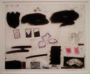
Perfectly balanced in a visual fantasia: Still Life with Iris by Elizabeth Blackadder, a two-plate etching with five colours and gold leaf.
Elizabeth Blackadder‘s Still Life with Iris, a two-plate etching with five colours and gold leaf, is one of the loveliest items I have seen on the contemporary art market. One has only to see a piece like this one to be swept away by the elegance and richness that can be brought to a semi-abstract composition, by the exquisite satisfaction of seeing everything on earth perfectly balanced in a visual fantasia. This work goes in symmetries and layers: three heavy black calligraphic marks at the top counterpoised to three equally heavy but far more deliberate and controlled black rectangles ranged in the lower part of the picture, one of them carved out in the delicate filigree of a fan. In the space between float three tiny scenes, also inscribed in rectangles, and three pink flowers; two tulips and one of those perfect irises which Elizabeth Blackadder does so well, organic but delicate as snow. All this is set on a background of thin lines and little sketches, which echo in silhouette the strong dynamics among these trios of shapes. The print costs £300 before publication; £350 afterwards.
Elizabeth Blackadder, at 58, is the youngest of these artists, a member of both the Scottish and the English Royal Academies. She is a great traveller, fascinated by those cultures whose delicate objects are without furbelows, and she has collected, across the years, an extraordinary assortment of small boxes, Japanese fans, Indian fabrics, Greek ceramics, and other similar items. Her Edinburgh garden is famous for its lilies and irises; whereas John Piper simply paints flowers, like a Victorian sentimentalist, Elizabeth Blackadder uses the pigments and shapes of her garden to limn an uncreated world of refined and mysterious objects.
There are hints that next year’s prints may be selected with a less conventional eye, that abstract work might move to centre stage and that artists below legal retirement age may stand a better chance of being included in the selection. One can only wonder how a complete set of NACF prints might be viewed or valued a hundred years hence.